Updates #7 – May 2026
Hello everyone 👋
This edition is packed with AI news and exciting updates around Android, Figma slots, and a better experience for Web developers. And let's not forget about our upcoming open session!
As always, let us know what you think in the Digital Design Community or via designkit@volvo.com, developmentkit@volvo.com or uxwriting@volvo.com.
In this issue:
Announcements
AI
- [New] AI Kit for Web Development
- [New] UX Writing AI assistant in VolvoGPT
- [New] VGDS Figma Make Kit (early access)
Design
Development - Web
Development - Mobile
UX Writing
Events
Updated guidance on Volvo Broad
Neither of these should be used in any digital designs. All remaining instances should be updated with our primary font, Volvo Novum.
When needed, use Noto Sans as our official fallback font.
Follow these guidelines for each font:
- ⚠️ Volvo Broad, with Brand guidance – only for events, digital screens at events, print materials, exhibition resources, and merchandise
- ✅ Volvo Novum – for all public websites (business areas, dealers, partners), portals, mobile apps, software, onboard and control panels*
*Onboard and control panels apply to Volvo Trucks, Volvo Construction Equipment, Volvo Buses, Volvo Autonomous Solutions, and Volvo Energy.
For more help determining the right choice for your use case, refer to these pages:
- for digital products and services – Design System typography
- for events, merchandise and non-digital marketing – Brand Identity typography
New Acting Head of Design System
After 6 years in Volvo Group Design, establishing and maturing the Volvo Group Design System, Eva Bärnheim recently started a new chapter in Digital Corporate - DTO as Head of Brand, Communication and Events, CSR.
Jessica Stenberg is now Acting Head of Volvo Group Design System as of May 1. Having worked side by side with Eva throughout the Design System's journey, Jessica has the knowledge, expertise and vision to lead this essential product to its next milestones.
Meanwhile, the VGDS's ongoing projects and initiatives are on track, and the system is operating at a business-as-usual level. If you have any questions about this change, reach out to Jessica.
AI Kit for Web Development
The new vcdk-ai-kit package provides curated AI coding agent skills based on the latest Volvo Group Design System assets. The package covers:
- 10 framework-specific skills for React, Angular, Vanilla JS, TailwindCSS, and Kendo UI
- foundation patterns – icons, tokens, and UX writing (product copy)
- complex components – charts and data grids
It's compatible with most AI coding assistants, including Claude Code, Cursor, OpenCode, GitHub Copilot, Codex, Windsurf, Gemini CLI, and over 50 others.
To access it, you can either enter the command via the skills CLI (npx skills add <...>) or use npm install, manual copy, or git sparse checkout. Choose the whole package or just specific skills you need, and handle updates via npx skills update.
We strongly recommend using this package to minimize AI hallucinations and generate code that works with the Volvo Group Design System out-of-the-box.
UX Writing AI assistant in VolvoGPT
We launched a beta version of the UX writing AI assistant, using the latest documentation from the Volvo Group Design System and the Volvo voice and tone definitions.
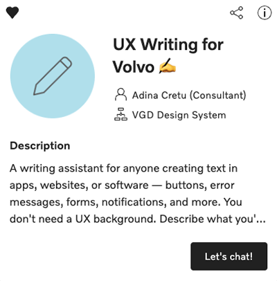
The assistant is intended to primarily create and audit UX copy (in-product content), based on content and design guidelines and our UX terminology. This includes: error messages, onboarding screens, empty states, helper text, labels, forms, buttons, navigation, and more.
Due to the general best practices in our documentation, it can also be used for other types of writing – with some limitations.
As a beta version, we need feedback from various types of users to identify areas of improvement. If you want to test the UX Writing AI Assistant send us an email at uxwriting@volvo.com – access is individual, per Volvo account.
VGDS Figma Make Kit
We recently launched a first version of a Figma Make Kit, based on our Design System. This allows you to prototype with a high degree of alignment, using variables, styles, tokens, and components from our design library – but without brand or content knowledge.
The kit or copies of it must not be published.
If you want to test the kit, access the source-file and create a personal copy.
Be mindful of the AI token usage when using AI features in Figma, as they consume your monthly AI token limits.
Improved Web side menu
We published several important updates to the side menu component for Web, incorporating many of the ideas we collected during our workshop sessions. Here's what you can start using right away:
- Figma slots – slots are replacing the swapper element, allowing a fully flexible reordering of menu items.
- More navigation depth – you can now add more than 2 layers. Keep in mind that complex navigation increases user effort and friction.
- Header and footer sections – insert persistent information or functionalities in both areas of the menu, using slots.
- List items in expandable menus are now selectable
- Icons persist when switching between expanded and collapsed states
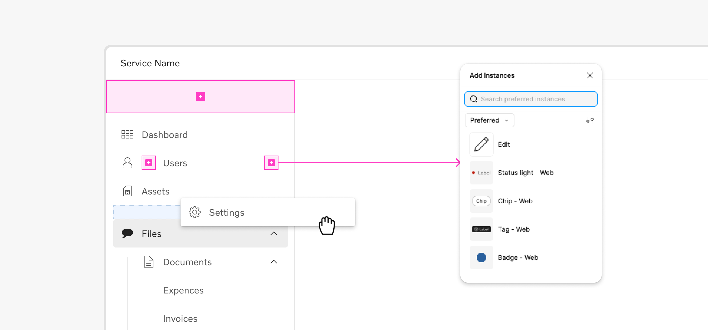
The Web side menu is the first component using Figma slots, but we'll continue to investigate more components where this feature would be beneficial. We also plan to implement most of these changes to the mobile version of the side menu soon.
Special thanks to those who joined our workshops and shared valuable input ❤️
Onboarding for designers
Getting settled in as a new UX designer can be challenging, from getting access to tools to understanding your product, team, and the organization itself.
We want to make this process easier and faster, so we just published a series of short, practical guides to walk you through the initial steps.
- The Design Kit – what is contains, how to use it, and how to get Figma access
- Themes – the themes we support and how to apply them in your work
- Swappers and slots – differences and use cases for these content containers
- Custom components – what to consider, how to create them, and where to store them depending on their scope
We're curious to hear your feedback, so share your impressions and ideas to make this series even better for both new and existing designers – designkit@volvo.com
Complete code examples
We finalized the audit of all the components within the Development Kit for Web, adding relevant examples to demonstrate their usage and capabilities.
100% of our Web components now feature code examples for multiple use cases, across 3 frameworks: React, Angular, and Vanilla JS.
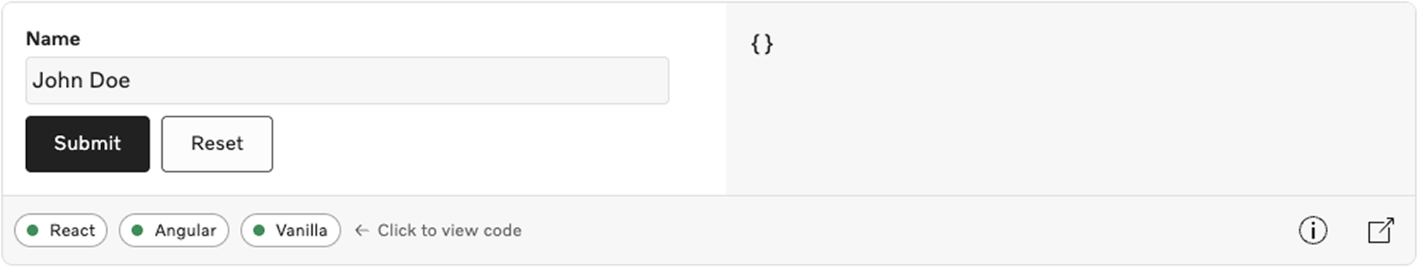
Access component pages in Storybook for individual examples.
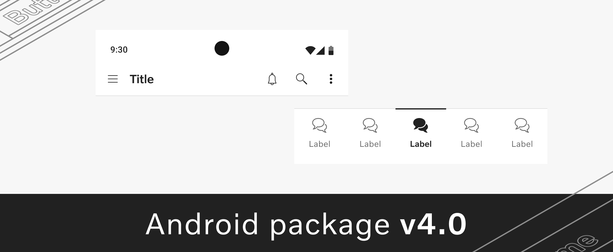
Android package v4
We launched version 4.0 of mobile-fp-vcdk-android, a major evolution of our Android package. It includes new elements, updates to existing ones, and a few breaking changes you should be aware of.
- New – frosted glass effect for secondary buttons, blur tokens, and splash screen patterns in the sample app
- Updated – completely rewritten app bar top, animated selection indicator for bottom navigation, enabled stated for context menu items, and many more
- Breaking changes –
VCDKButtonSizesrenamed toVCDKButtonSize
See the full list on the Android changelog page, along with instructions for the breaking changes.
Android icon library v3
We refreshed our icon library to include 3 new icon packages:
- Prevost –
fp-vcdk-icons-prevost - Volvo Trucks North America –
fp-vcdk-icons-vtna - Generic icons –
fp-vcdk-icons-generic
The icon library v3.0 update also comes with breaking changes so review these before usage:
Outlinedicon style was renamed toLined- Icon name formatting was changed to PascalCase
All information is available on the Android changelog page.
Onboarding for writers
The number of teams, channels, products, and volume of content created in Volvo Group is impressive. It can also be a bit overwhelming for a new writer.
Our new page dedicated to onboarding for writers shares a few starting points to make orientation a bit easier – an overview of the company structure, writing communities, people to connect with, tools, guides, and an intro to the Volvo Group Design System.
Share with people who might find it useful and let us know if you have any suggestions for improvement via uxwriting@volvo.com.
Open session for Figma slots
On May 12 we're hosting an introductory session focused on the new Figma slots feature. We'll cover what it is, how we're planning to bring it into the Volvo Group Design System, and answer your questions about this topic.
Meet us via Teams on May 12, at 3 PM CEST and join the conversation!

Connect with us
We're here to support you, clarify guidelines, or offer feedback - together we can achieve so much more. Reach out anytime with your ideas, questions, or requests.
Contact
designkit@volvo.com
developmentkit@volvo.com
icons@volvo.com
uxwriting@volvo.com
Resources
Design Kit in Figma
Development Kit in Storybook
Volvo Group Design System site
P.S. Like our newsletter? Share it with others to subscribe 🫶