Updates #6 – March 2026
Hello everyone 👋
Starting today, we're happy to welcome you to the new home for the Volvo Group Design System newsletter. All our updates (and we have a lot for you!) and email archive will live on this new platform.
Now let's get busy: we've published plenty of improvements and new releases throughout the winter, and they're waiting for you to explore.
Test them and let us know what you think. Let's talk in the Digital Design Community or via designkit@volvo.com and developmentkit@volvo.com.
In this issue:
- Announcements
- Design
- Icons
- Development – Web
- Development – Mobile
- UX writing
- Events
Upcoming: Volvo Broad removal
The Volvo Broad font is planned for permanent removal from the Volvo Group Design System. This Volvo-brand-exclusive font has always been limited to specific contexts, and it's now time to start replacing it across all digital products, services, and platforms. In short:
- Volvo Broad will soon be retired
- The Display Statement text style will be removed at the same time
What should you use instead?
Volvo Novum remains the primary choice for all Volvo-branded digital interfaces. Noto Sans is the official fallback font.
Read more about their correct usage on the Volvo Experience System portal.
Design System components in Adobe Experience Manager
The Adobe Experience Manager team has implemented the Volvo Group Design System components in 700 websites and portals across 150 domains.
Amit Shukla, Digital Product Owner - Adobe Platform
More than 250,000 pages now share visual consistency, a single CSS file for styling across brands and components, a cleaner codebase, and multiple accessibility and user experience improvements for our customers.
Updates on Salesforce theming
We have reached the implementation phase and we’re working towards an MVP release. As a first major step in the process, we’re focused on building a foundational visual layer through global design tokens within the Salesforce Lightning 2 design system architecture.
The outcome of this step will be a centrally-maintained and cost-efficient baseline for brand consistency.
We also coordinated with Salesforce on our technical architecture, to ensure long-term compatibility and a robust infrastructure ready to scale and support future developments.
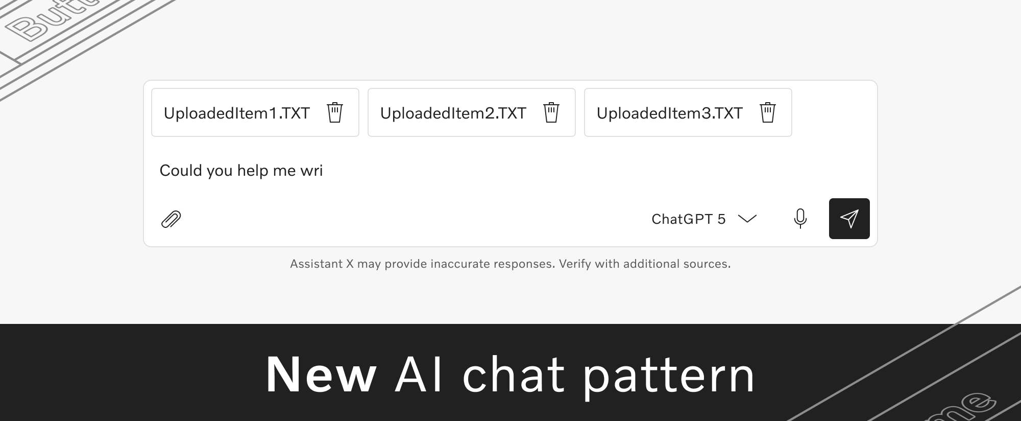
New AI chat pattern
You can now find the AI chat pattern in the Design Kit, while the corresponding documentation is available on the Volvo Experience System portal.
The documentation includes principles, brand guidelines, and recommended usage primarily for AI chat experiences, along with general rules for naming and building responsible AI products within Volvo Group.
Compact density for Web (beta)
Our web components now support compact density, in both Figma and code. When you use compact density, all spacings are reduced by a factor of 0.625, so you can fit more content in the same area.
Compact density is especially useful when designing information-dense and productivity-focused applications. Read more in our density documentation.
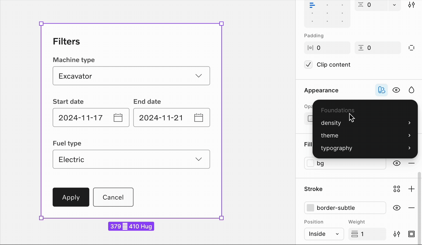
Improved responsive layout grids
We optimized the margin and gutter values for both fixed and fluid layout grids, resulting in updated breakpoints and increased maximum content widths.
These grid improvements provide greater flexibility and allow for increased content width within the fixed grid, helping deliver a better experience across all screen sizes.
We're also working on creating detailed documentation to give you an overview of all the options and implications of the updated grids.
Stay tuned for our announcement in the Digital Design Community later this week, as soon as we publish the new layout grids and guide.
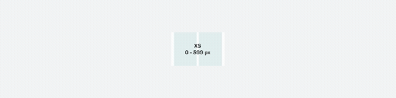
Finalized liquid glass components
The last batch of liquid glass components for iOS 26 is now available in the Design Kit, including the action sheet, app bar top and bottom, content switcher, dialog, and pagination.
With this release, our set of liquid glass components is complete in design and supported in system-native code components. All previous iOS components remain available, so your work can support both newer and older iOS versions.
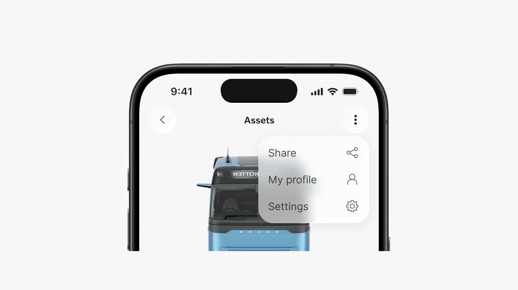
Updated slider component
The slider component now has more out-of-the-box elements – helper text, error state, and steps – to better adjust to your scenario and user needs.
Read more about these slider changes on the Volvo Experience System portal.
Ecommerce design exploration
A few days ago, we conducted a workshop on how the design system can better support ecommerce solutions. We explored which components, patterns, and guidelines would help teams build ecommerce experiences more efficiently, while also improving quality and consistency. "Thank you" to everyone who participated!
Next, we'll review the insights and outline a plan for when and how we can introduce dedicated support for ecommerce in the future.
We also welcome more input and volunteers willing to get involved in our future ecommerce work at designkit@volvo.com.
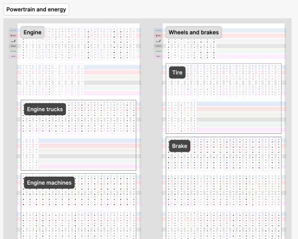
Improved icons library structure
We made it easier to find what you need by applying the architecture in our icon families file. Now the system icons library is organized by categories, subcategories, and families.
As a reminder:
- icon categories and subcategories are defined by the icon's purpose
- icon families are groups of icons that use the same element
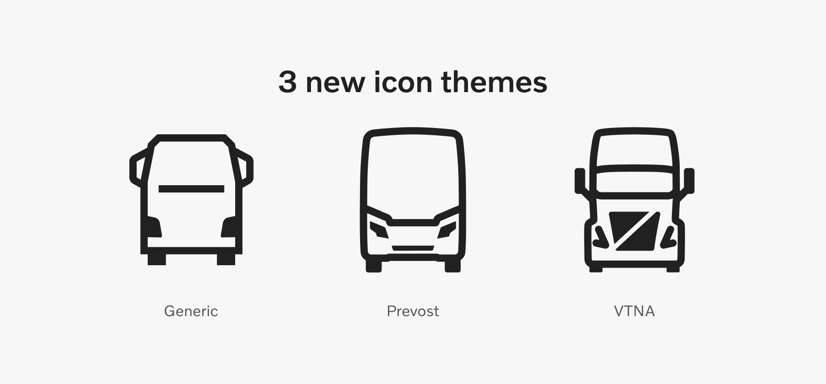
New icon themes
The Volvo Group system icons library has expanded with 2 new branded themes, for Volvo Trucks North America and Prevost. We also published a Generic theme, to accommodate more teams and projects.
The library now includes over the 40,000 icons and variants, supporting 5 brands, 1 generic theme, and lined/filled variants for every icon.
Read more about our system icons on the Volvo Experience System portal.
Agentic engineering
The Volvo Group Design System is transitioning into a machine-interpretable data layer through GitHub MCP and Figma MCP. These protocols let us define compliant codebases and design contexts for agents used in product development.
The goal is to help teams across Volvo Group create agent-generated software that is compliant with our brand, design, and development standards.
Agentic engineering integration is now in rollout, in partnership with the AI Assisted Development team. You can get started today, using our quick guide.
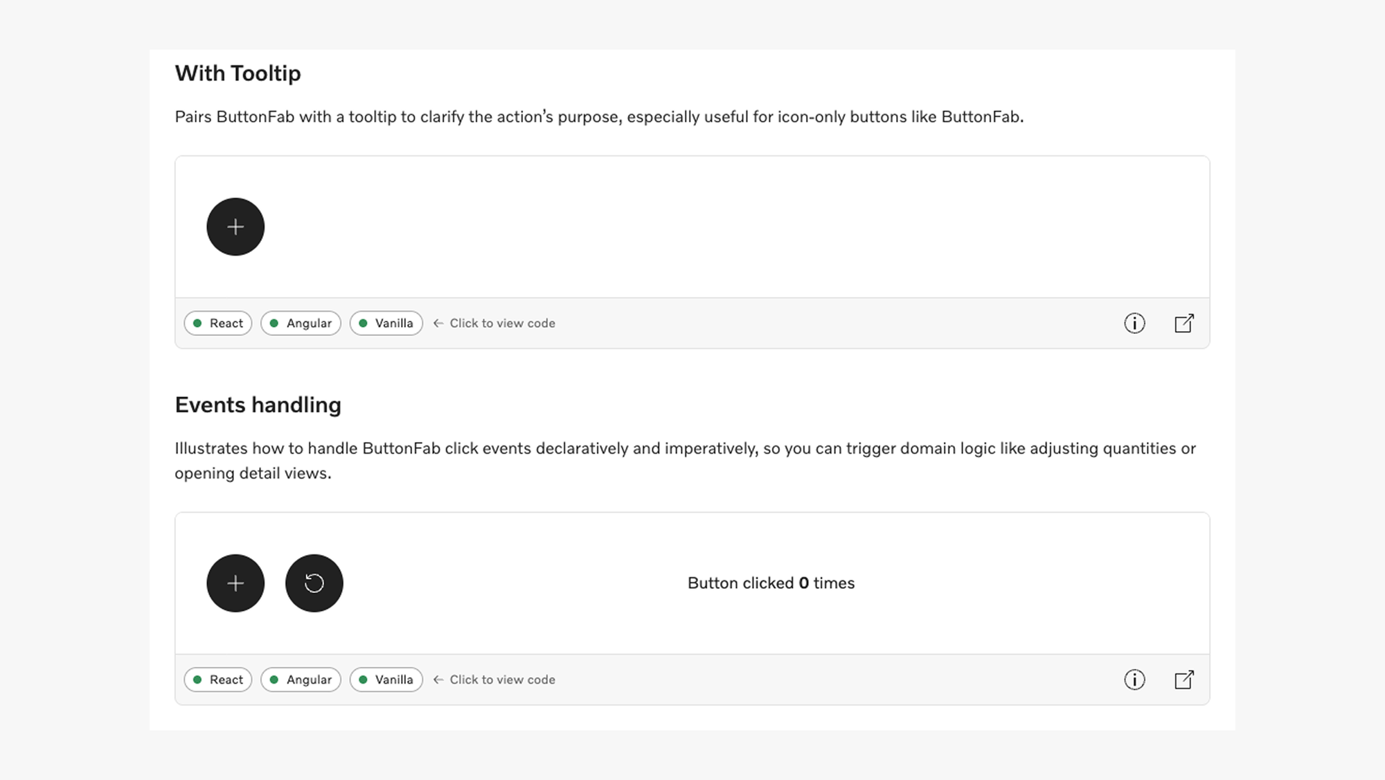
Extended code examples
We started adding richer code examples for every Web component, showcasing potential use cases for each of them.
The examples provide code snippets for React, Angular, and Vanilla frameworks, making it easier to envision and build your own scenario.
This is an ongoing initiative, meaning not all components have yet been updated. Updated components will display an "Examples" section in their individual page.
Check the app bar top, breadcrumbs or button fab for current examples.
Improved validation
A key feature of our core components is the full support for validation, for both native validation and 3rd parties like Angular Forms or React Hook Form.
To help reduce friction and create a substantially better experience for our customers, we'll soon release major improvements for all form-enabled components: custom validation messages, delayed (touched) state, and button attributes like “formNoValidate” or “formTarget”.
These will help delay system feedback until the user input is complete, prevent input errors, and allow for real-time validation when needed. These updates will align our components’ behavior to human-centered interaction patterns across all form-enabled elements.
Our forms documentation will also be updated to address the new capabilities.
Improved interface scaling
All our components now support 2 different systems when scaling the interface, in addition to zooming:
- global scaling – for proportionate UIs
- density-based – for developer-controlled spacing, as normal or compact scaling
To scale up or down, always use the root font size (rem). Read more about each system and how to apply them on the Development Kit portal.
iOS icon generator
The icon generator script lets you create an xcasset whenever you need a Volvo Group Design System icon that's not available in your current theme catalog.
Assets are generated based on a JSON configuration file stored in the project, so the script requires only one input – the location of the configuration file – to create themed icons in both filled and lined versions.
Visit the documentation page for details about how to use the script.
New iOS components
When building on iOS you can now include 4 more components in your designs:
New content resources
We published 3 new content patterns to support better copy in some of the most common and impactful types of content:
- 404 pages, loading states, and empty states - scenarios in which the content or interaction doesn't match the user's expectations
- system (automated) emails - transactional emails triggered throughout the user's journey
- content in AI - brand and functional content for AI products
Volvo Group Design System open sessions
Join our regular open sessions to find out about the latest releases, ongoing projects, and planned work within the Volvo Group Design System team.
Maybe even more important than our updates, this is a perfect time to raise your questions, share your team's needs, and help us prioritize our next releases.
Our next open session happens on March 18 and you can add it to your calendar from Violin. You can also see all our upcoming meetings and events on our dedicated page.

Connect with us
We're here to support you, clarify guidelines, or offer feedback - together we can achieve so much more. Reach out anytime with your ideas, questions, or requests.
Contact
designkit@volvo.com
developmentkit@volvo.com
icons@volvo.com
uxwriting@volvo.com
Resources
Design Kit in Figma
Development Kit in Storybook
Volvo Group Design System site
P.S. Like our newsletter? Share it with others to subscribe 🫶