Updates #1 - December 2024
Hello, Design System community 👋
Welcome to our debut newsletter about the Volvo Group DesignSystem!
Starting now, we'll notify you whenever we have important updates about components, guidelines, brand expression, or ways of working.
Mandatory framework for accessibility
Volvo Group published 3 mandatory accessibility directives to align our work in design, development, and UX writing with the EU legislation coming into effect in 2025.
Their purpose is to support you in meeting the requirements for accessible, inclusive, and compliant digital experiences.
See the accessibility directives
New fonts for Volvo and Renault Trucks
Volvo Group no longer has the legal rights to use Helvetica and Aral for our websites and apps. Therefore, it's a priority for all public digital touchpoints and customer-facing content for Volvo and Renault Trucks to be updated to our new official fonts as soon as possible.
For the Volvo brand (on the Volvo Experience System portal):
- Primary font: Volvo Novum
You can still use Volvo Broad or Volvo Instrument in specific cases, but check with brand@volvo.com first. - Fallback font: Noto Sans
For Renault Trucks (on the Renault Trucks brand portal):
- Primary font: DIN Pro (for web) and Roboto (for mobile)
- Fallback (substitution) font: Roboto
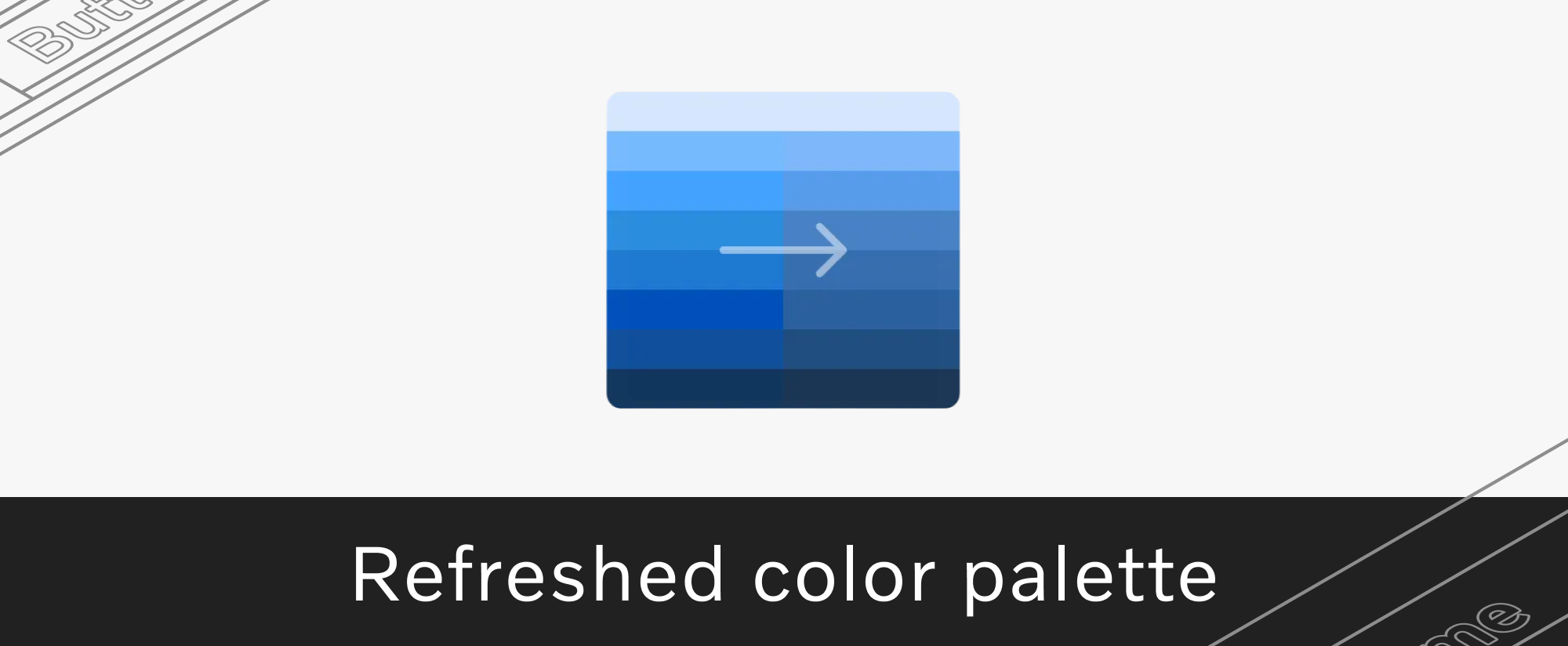
Refreshed color palette
Following requests we received from multiple teams, we're happy to announce several updates to our color palette.

All decisions were made in partnership with the Brand team and in alignment with accessibility requirements.
New components available
We recently published several new components, including:
- Split button - main action and context menu in a single component
- Timeline - history of events or progress indicator for multi-step processes
- Tree view - browse elements (ex. menus, filters) in a hierarchical structure
Small components for busy interfaces
We noticed a growing demand for compact components to accommodate information-dense applications.
Based on this insight, we're introducing "small" versions for several components: banner, card, checkbox, context menu, dropdown, link, list, radio button, search field, side menu, switch, tab, text field, and time picker.
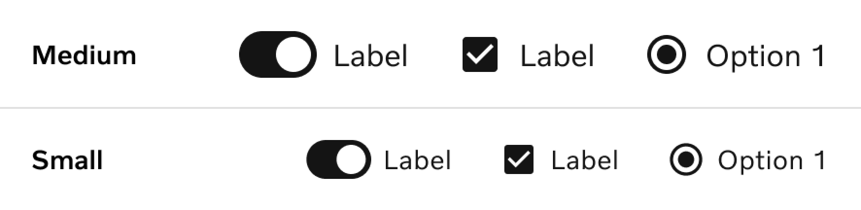
Note: the default size for all components remains "medium".
More resources for data-rich dashboards
We're creating additional resources and guidelines for data visualization, including chart components, dashboard-specific elements, layout templates and more.
Feel free to contribute! Share your design at designkit@volvo.com.
New icon approval process for 2025
To ensure consistency in our growing icon library, we defined an updated approval process for icons - from the initial request to the design work, ISO and legal reviews and the final confirmation.
This process will be implemented in 2025, once our upcoming icon database is launched. Until then, join our monthly status update calls to learn more.
V1 release for our token package
Our design tokens reached a special milestone: the v1.0 release of the tokens package. This is a confirmation of their maturity and robustness, after rounds of testing and iterations.
Support for right-to-left languages
Right-to-left languages are now officially supported on all our platforms. This Development Kit update should reduce your localization efforts and improve the overall user experience.
Component status overview
Many of you have asked for this and we're now happy to say: it's live!
Now you can use our dedicated page to check the latest development status of each component across our Web, Android, iOS and React Native Development Kits.
Other Web Kit updates:
- Favicons for Volvo, Renault Trucks and Mack brands
- New hero and stepper components for engaging layouts
- Upgraded dropdown filters for single and multiple selections
- More customization options for the side menu
- Ongoing optimization of each component's rendering performance
Full documentation for React Native
You can now access detailed documentation for each component developed in our React Native library. This includes multi-brand previews (Volvo, Renault Trucks, Mack), where applicable.
Several improvements for Android
- Released V3.0 of our sample app and component library
- Improved the side menu and wheel picker components
- Added the diamond button for Renault Trucks
- Updated the typography token
Documentation and new components for iOS
- Full documentation for existing components, along with updated FAQ and troubleshooting guide for git-lfs and R.swift
- Released new components: banner, status light, inline message
- Added accessibility support for dynamic fonts in components
- Added integration tests for Xcode support (15.x and 16.0), Swift 5.x and iOS 16 or newer
- Introduced support for iOS 18
- Implemented Swift Package Manager access on GitHub for external emails (via VolvoGroup-External)

Connect with us
We're here to support you. Reach out with your ideas, questions, or requests about component design, code and usage, icons, accessibility, or UX writing.
P.S. Like our newsletter? Invite others to subscribe 🫶
Contact
designkit@volvo.com
developmentkit@volvo.com
icons@volvo.com
uxwriting@volvo.com
Resources
Design Kit in Figma
Development Kit in Storybook
Volvo Group Design System site