Updates #5 - October 2025
Hello everyone 👋
We’re all back in the driver’s seat, turning up our autumn engine, and we’ve got plenty of updates to make your ride smoother. Ready?
As always, we’re curious to hear your feedback, so share it with us in the Digital Design Community or via designkit@volvo.com and developmentkit@volvo.com.
In this issue:
- Announcements: VGDS now in Planview
- Accessibility: step-by-step compliance guide
- Development:
- Web Core package v10
- data grid improvements
- iOS 26 support
- Design:
- new “popover” component
- new “selector” component
- Salesforce theming
- UX writing:
- new guidelines
- Paper Jam copy support team
- Events: UX Day in November
VGDS in Planview
The Volvo Group Design System was recently added to Planview, and you can now find us using the APM ID 169821.
If you’re not familiar with Planview, you can read more about its capabilities on SharePoint.
The VGDS accessibility handbook
Accessibility requirements can be puzzling and raise questions like :
- which requirements apply to my product?
- why is this criteria important?
- what do I need to test and how?
That’s exactly why we analyzed each WCAG 2.2 criteria, explained their purpose in a relatable way, and created step-by-step checklists you can use when reviewing your products for compliance.
Check our Get started page to familiarize yourself with the process and dive into the compliance guide when you're ready for an in-depth evaluation.
Got questions or feedback about these resources? Join us in the Accessibility channel and share your thoughts.
Web Core package version 10
The milestone v10 release focuses on delivering a leaner, more standards-compliant foundation. It includes:
- support for native HTML5 browser form validation
- a new file uploader component — single/ multiple file selection, drag-and-drop functionality, and specific events
- support for easy localization configurations
- substantial library optimizations — deprecating, updating, and fixing components (minor issues)
See the full list of changes in Storybook and check the migration guide for more details.
Data grid accessibility and improvements
We further developed the data grid component and added a series of refinements:
- keyboard navigation is now enabled by default
- actions feature improvements, allowing you to invoke built-in or custom actions throughout the data grid
- new export functionality to provide your users with downloadable Excel or CSV files
New iOS components
We added several new entries to the iOS library, including the content switcher, context menu, and empty state pattern.
We also updated the avatar and list components and continued to optimize accessibility features, like font resizing.
See more details in our release notes.
With iOS 26 recently launched, we’re also working on adding full support for the Liquid Glass effect.
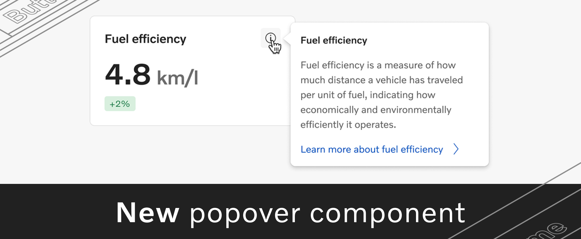
New popover component
A popover is an overlay that displays contextual information or actions.
While the tooltip component is intended only for short text, the popover supports more interaction and multiple types of content, such as titles, links, or swappers.
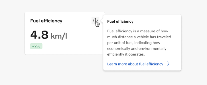
Read more about popovers and their usage on the guidelines page.
New splash screen pattern
Android and iOS apps can now display the newly designed splash screen pattern, featuring the logotype at its center.
You can start using the pattern right away, from the Design Kit for Android and iOS.
Existing component updates
Bottom navigation
We added a line to the bottom navigation component, to highlight selected sections even when the icons don't have a filled version.
Thanks, Daniel Berg, Linnea Jading, and Lena Huynh for your help!
Button
Secondary buttons in the Volvo theme now have a blurred background effect, recommended when you need to improve contrast and readability in rich visual contexts.
Page filters
We updated the guidelines for the page filters pattern, using your input to define rules that match the most common use cases.
A big “thank you” to everyone who contributed ❤️
Salesforce theming kickoff
Our team is officially in the analysis phase of the Salesforce theming project across the Volvo Group. We’re running an in-depth review of how business areas use various Salesforce products, while also evaluating the technical capabilities of each product in relation to theming.
The data we collect through this process will help us identify key opportunities for visual consistency and comprehensive specifications for the implementation phase.
Together with the Salesforce CoE team (to be established within Digital & IT), we aim to deliver a brand-compliant, consistent, and scalable visual solution, starting with the areas with the highest impact.
More resources for your UX copy
We’re continuing to expand our UX writing guidelines, and we recently published several new pages:
- UX terminology — an index of over 100 key terms used across our digital interfaces, classified as action words and general terms. Each term features usage recommendations and related or paired terms to guide your content choices.
- Content patterns — a new section with guidelines for frequently used content types. The first 2 guidelines cover app descriptions and release notes, with more topics on the way.
We’re always looking for feedback and ideas, so reach out at uxwriting@volvo.com to help us plan our next resources based on your needs.
New in-house group for copy quality
Content is a key ingredient of the user experience, influencing how our brand, products, and services are perceived. Good content can also be a challenge, depending on the resources, expertise, and time at your disposal.
To help you ensure that your copy meets Volvo Group’s standards of quality, clarity, and consistency, experts from multiple departments joined forces to create Paper Jam - the in-house copy agency.
The Paper Jam team offers copy reviews, edits, and guidance to anyone looking to improve external-facing content.
Visit their SharePoint page to read more about the Paper Jam team, how they can support you, and how to get in touch.
UX Day in November
The UX community’s second event of the year will bring the sunshine back in November and raise a hot topic: emerging technologies.
We’ll be looking beyond tools or trends to the shifts in how people connect, create, and experience the world. Join designers from around the organization for exciting presentations, discussions, and networking rounds on November 12.
Thinking of sharing your thoughts or experiences on this topic? Now’s the perfect time to sign up as a speaker.
Follow our updates in the UX Day channel and don’t forget to save your seat!
VGDS open sessions
Our team will host 2 open sessions in the near future to discuss our ongoing projects and collect your feedback and ideas for future initiatives.
Check our events in SharePoint and join the conversation!

Connect with us
We're here to support you as co-creators, to clarify guidelines or to offer friendly feedback - together we can achieve so much more.
Reach out with your drafts, ideas, questions or requests about component design, code and usage, icons, accessibility or UX writing.
Contact
designkit@volvo.com
developmentkit@volvo.com
icons@volvo.com
uxwriting@volvo.com
Resources
Design Kit in Figma
Development Kit in Storybook
Volvo Group Design System site
P.S. Like our newsletter? Share it with others to subscribe 🫶